
Understanding user behavior is the key to creating impactful designs, and key performance indicators (KPIs) offer a data-driven view to decode and interpret behavioral patterns. After all, who is the final product for if not for the user? By researching user needs and analyzing quantifiable metrics, design teams can uncover valuable insights into user preferences and possible issues to create practical and effective designs and improvements.
Navigating a website shouldn’t be complicated, and whilst that may seem an obvious statement, it’s surprisingly easy to fall into the trap of designing an overly-complex site or interface without considering the needs and level of the target user. In this article, we will explore how analyzing user behavior can help bridge the gap between data and design improvements, helping teams adjust their design process in accordance with user expectations. From identifying errors in navigation, to enhancing engagement, tracking user behaviour through KPIs ensures the final product is both user- and results-oriented.
WHAT ARE KPIS?
A KPI, or “key performance indicator”, is a performance measurement used to determine the effectiveness of a product or interface in meeting the needs of both the user and the business. When it comes to UI design, it is vital to keep the experience of the user at the centre at all times. This ensures that the design works in favour of the user and is not just based solely on the preference of the design team.
In order to ensure we are centering the user at every stage, we need a set of measurable points to quantify user experience so that we can pinpoint what is effective, what leaves room for improvement, and what is just plain not working.
UI design should not be a matter of personal taste or subjective preference. Instead, the effectiveness should be evaluated based on KPI results, which provide a clear and objective measure of quality and usability. There are two categories of KPIs; behavioural and attitudinal.
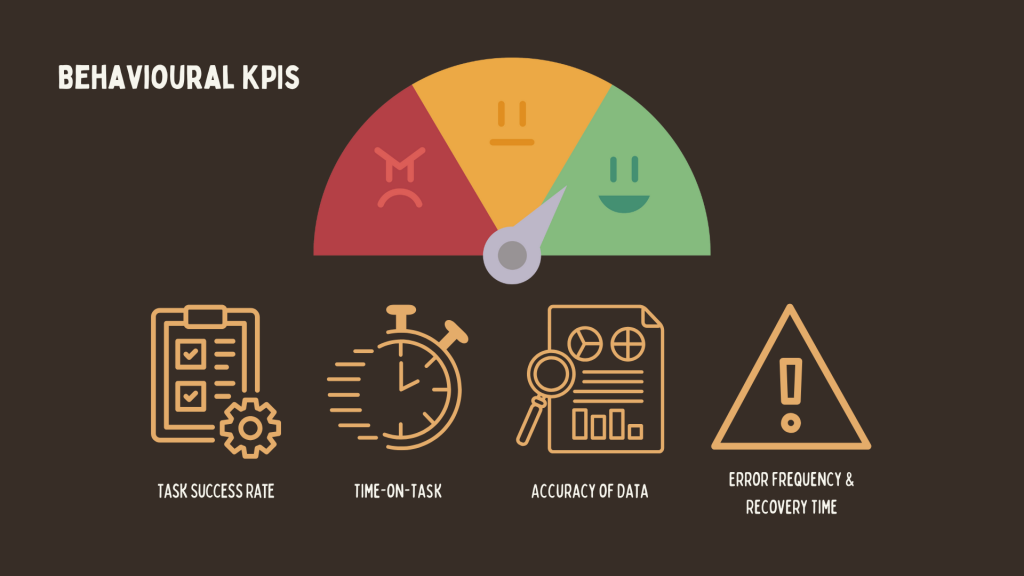
BEHAVIOURAL KPIS
There are many methods of measuring various behavioural KPIs, but we will focus on a few key points—time-on-task, data accuracy and error rate.
Time-on-Task
Time-on-task is used to measure the amount of time a user takes to complete a specific task or to hit a goal. This could be a task such as filling out a form, buying a product, or even navigating to a certain page. This specific KPI indicator is helpful since it shows how quickly and efficiently a user can complete a task. In simple terms, a shorter completion time can demonstrate a well-designed interface, whilst longer completion times may indicate a task or interface that is too complicated or confusing. However, when analysing time-on-task data, context is essential. The nature of the task determines what constitutes a “good” result. For example, tasks that require attention to detail or the completion of lengthy forms may inherently take longer to finish, therefore making the data from the time-on-task KPI inaccurate in this instance.
Accuracy of Data
When using KPIs, measuring the accuracy of data is vital, as the quality of input has an impact on how effectively the user can complete the task. If information is missing or incorrect, how is the user supposed to accurately complete the task? For example, when purchasing a concert ticket via a website, is all of the information accurate? The time, date, venue etc? This can have an impact on user trust; not only is it possible to submit the wrong information, but it also appears very unprofessional.
Error Frequency
We’ve examined speed and accuracy, but we should also consider how often users encounter errors and what causes them. Frequent errors can frustrate users and increase the likelihood of them abandoning the task entirely. Persistent issues not only hinder usability but also create the impression of a lack of care and attention to detail, undermining trust in the design.
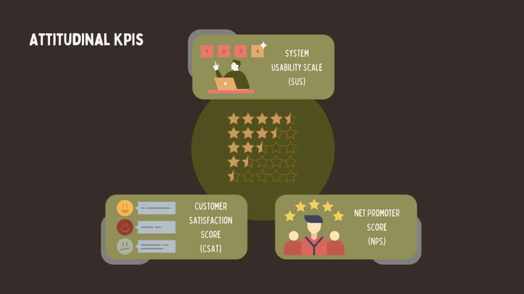
ATTITUDINAL KPIS
As well as behind-the-scenes KPI methods (such as time-on-task, accuracy of data, and error frequency), there are also methods that are more personal and involve asking the user for direct feedback. This can be useful, as it delves deeper into personal experience and feeling, instead of just what they’re doing.
System Usability Scale (SUS)
The System Usability Scale is an effective tool for gauging a site’s usability. The framework is 10 questions, which users can answer using the 5-point “Likert scale”—ranging from strongly disagree to strongly agree. The standard average SUS score is 68% (equivalent to grade “C”), with any score below 51% being a fail.
Customer Satisfaction Score (CSAT)
“How satisfied were you with your experience?”
The CSAT directly asks users how their experience was, using a scale of 1-5 or 1-10, where higher numbers indicate greater satisfaction. Respondents provide a score on this scale, and the CSAT score is calculated as the percentage of positive responses. This is then divided by the total number of responses, multiplied by 100.
Net Promoter Score (NPS)
“How likely are you to recommend [_____] to a friend or colleague?”
Similar to the Customer Satisfaction score (CSAT), the Net Promoter Score works based on asking the user how they would rate their experience on a scale. Respondents rate their likelihood on a scale from 0 to 10. Based on their score, they are categorised into three groups:
Promoters (9–10): Loyal users who are likely to recommend your product as well as return
Passives (7–8): Satisfied but unenthusiastic customers who are vulnerable to competitive products
Detractors (0–6): Actively unhappy customers who may discourage others from using your product
The NPS is calculated by subtracting the percentage of detractors from the percentage of promoters: NPS = (% of Promoters) – (% of Detractors)
It is important to remember that a good mix of KPI methods is important in creating more of a well-rounded picture of the product’s success. By combining customer-facing attitudinal KPIs with more behaviour-driven metrics, the design team can get a clear and in-depth view of not only what users do, but also how they feel.
These KPIs, along with many others, contribute to transforming user data into actionable insights for improvement. This information should not be seen as static; i.e. measure once and move on. It’s important to keep on top of any issues that may arise and to make consistent improvements. This will ensure that the design remains aligned with user needs, adapts to evolving behaviours, and continues to deliver an optimal experience over time.
Ultimately, all of these KPIs—along with countless others—work toward a common goal: building and maintaining user trust by designing a product that is user-friendly and uncomplicated. In order to build user trust, we must first know our user, and that’s where design thinking comes in.
USER BEHAVIOUR AND THE DESIGN PROCESS
There are many variations of the Design Thinking process, but as I learnt the process through the Interaction Design Foundation, this is what I will focus on.
What is design thinking, and how does it link user behaviour and UX/UI design decisions? Making this link is pivotal to creating successful UX/UI that users can trust. This is because design thinking centres on the user rather than the product/design.
There are many different variations of this process, and the stages may vary from institution to institution, but the IxDF teaches the tried and tested 5 step framework.
Design thinking is a user-centric approach that actively incorporates both the needs and feedback of users throughout the development process. By focusing on understanding the user experience and identifying issues early, this problem-solving methodology allows teams to pinpoint potential issues and address them proactively. It fosters innovation by encouraging iterative testing and refinement at every stage of the design process, from the empathy stage, right through to implementation. This reduces the likelihood of significant problems arising later, ensuring a more polished, efficient, and user-friendly final product. Ultimately, design thinking bridges the gap between user expectations and business goals, delivering solutions that are both practical and impactful.
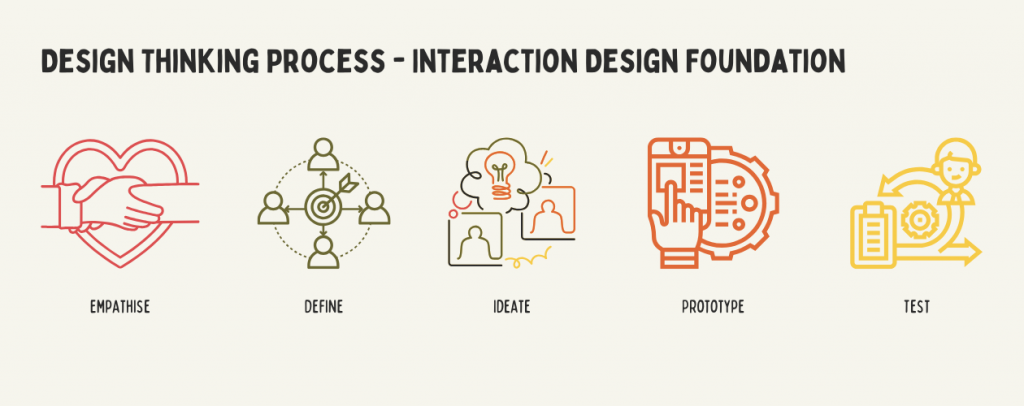
The Five Stages of Design Thinking
There are 5 non-linear stages to the design thinking process:
Empathise | Research the User
To begin with, research the user and their particular needs. What will benefit them and how can we centre our design around these specific needs? The aim is to design with the user’s needs in mind, not the team’s preferences.
Define | State User Needs and Problems
This information will then need to be analysed and assessed to define any issues that may arise. This is written in the form of a “problem statement”, where the team will find specific solutions to adapt the design, whilst still keeping it user-centric.
Ideate | Brainstorm Ideas, Think Outside the Box
Now we have two important things: the user needs and possible issues that may arise. In the “ideate” stage, it is time to brainstorm ideas based on these two factors, ensuring designs are still focused on the user. This is the stage to think innovatively to solve the issues in the problem statement.
Prototype | Create Solutions
Now is the time to “do”. This is the experimental phase, where teams can start to make prototypes and to really pinpoint where the solutions lie to the problems. As this is a prototype, this stage should not be costly; a mini version of the product should suffice for prototyping.
Test | Try Out the Solutions
After the prototype phase, a product should be ready for real users to try it out! This is the time when new problems may become clear. After collecting feedback from real users, the team can then go back to a previous step to further refine the product.
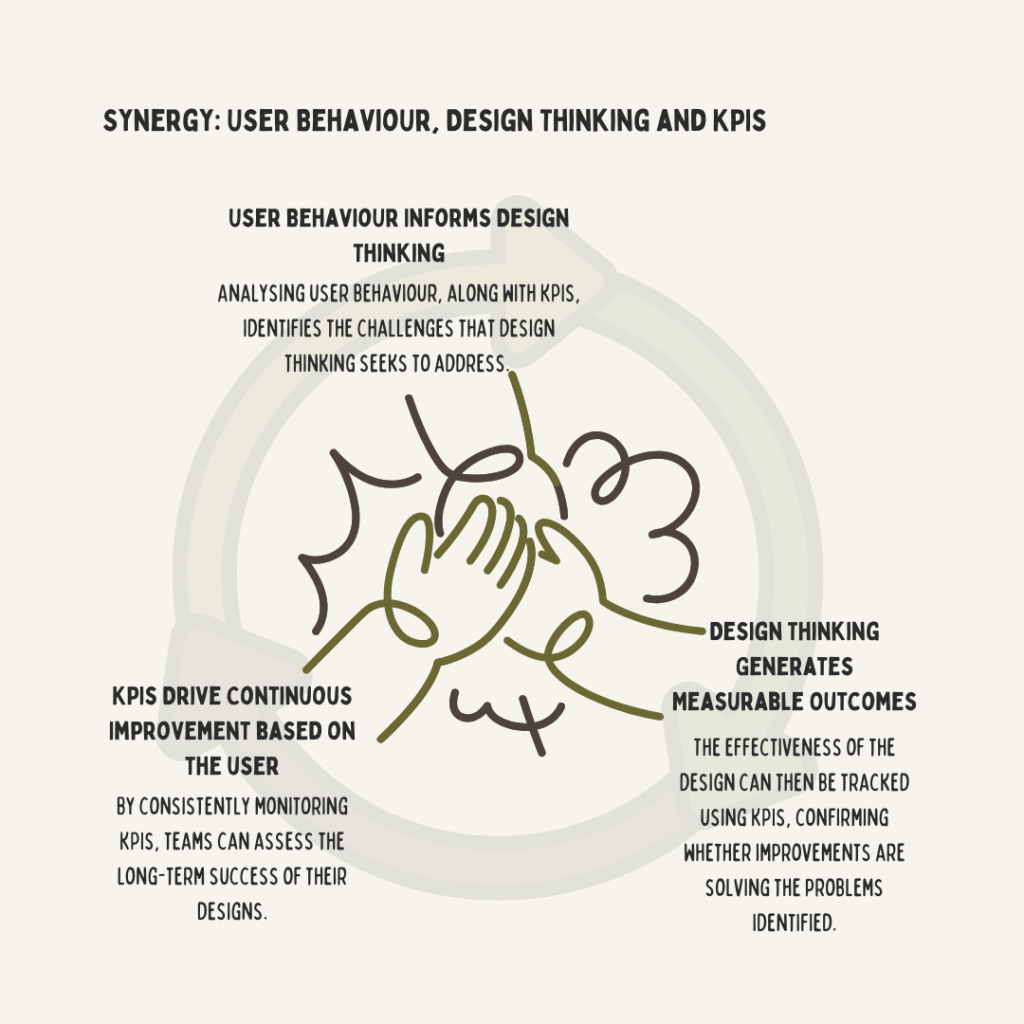
LINKING USER BEHAVIOUR, DESIGN THINKING AND KPIS
The relationship between user behaviour, design thinking, and KPIs is a coordinated cycle that drives successful product development and optimisation. When these elements work together, they ensure a user-centred approach that leads to both a seamless user experience and measurable business success.
User Behaviour: The Foundation
User behaviour provides the data necessary for understanding how users interact with a product or interface. By analysing behaviours such as navigation patterns and task completion rates, designers gain a deeper understanding of user needs and preferences, as well as any potential issues. This data forms the foundation for informed decision-making in the design process and is relevant right from the “empathy” stage.
Design Thinking: The Process
By empathising with users, defining their needs, anticipating issues, formulating solutions, prototyping designs, and testing thoroughly, design thinking transforms insights about user behaviour into actionable improvements. It is inherently user-driven, making it an ideal method for addressing the problems identified through behaviour analysis.
KPIs: The Measure of Success
Key Performance Indicators bridge the gap between user-focused design and business objectives. They provide measurable benchmarks to evaluate whether the design decisions influenced by user behaviour and design thinking are achieving the desired outcomes.
By defining the relationship between these three elements, design teams can create a feedback loop and process between the user and the product, with the user always being at the heart of the design. Now that we can define the link between the user and the design process, we can look at mapping KPIs to user behaviours.
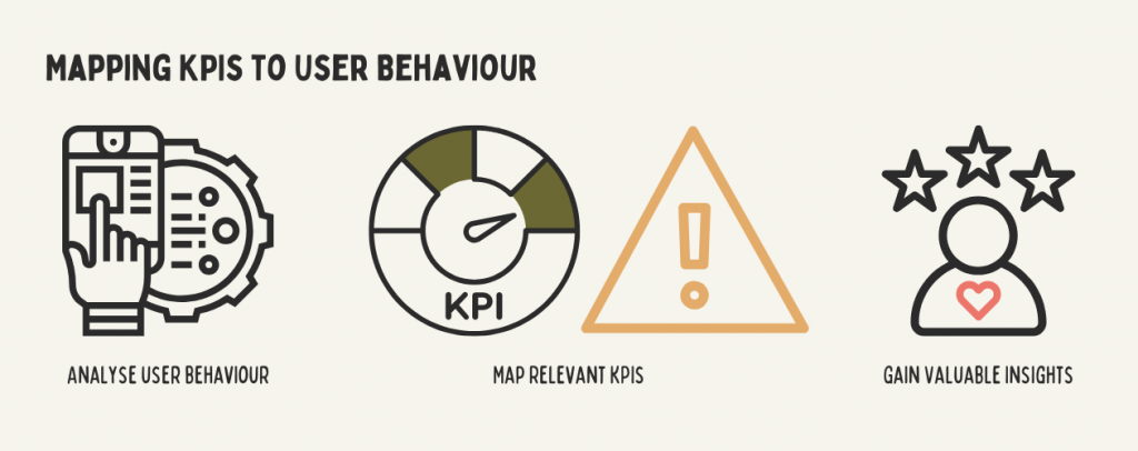
MAPPING KPIS TO USER BEHAVIOUR PATTERNS
If the entire design process starts with the user at the centre, it is only logical to keep the user at the centre throughout, in order to evaluate the success of the design and to implement constructive improvements.
This is where KPIs come into play—by providing measurable insights into how well the design meets user needs and expectations. By tracking KPIs such as task completion rates and error frequencies, teams can assess the effectiveness of their solutions. KPIs ensure that the user-focused nature of design thinking continues even after launch, allowing for ongoing refinement and optimisation based on real user data.
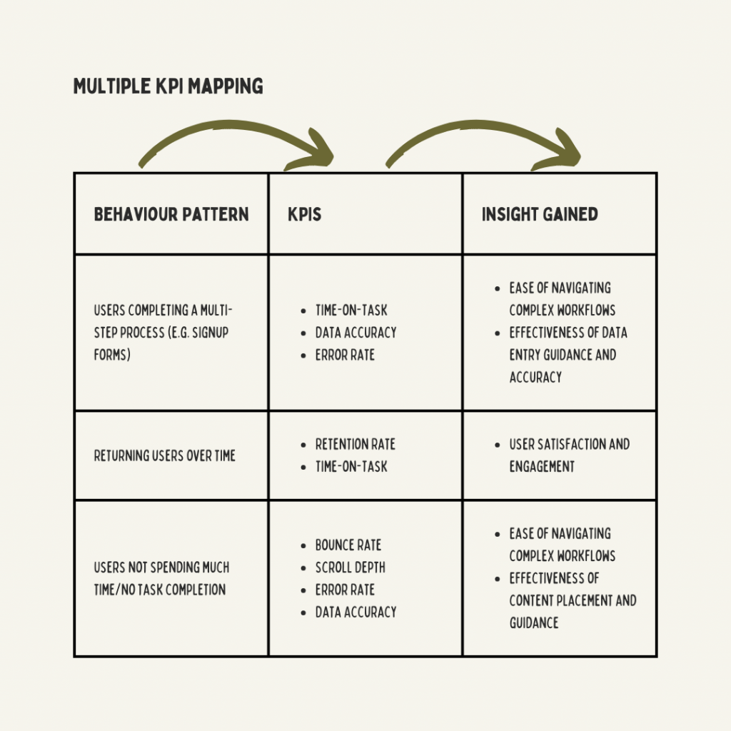
Why Map Multiple KPIs to One Behaviour?
It is not only possible to assign more than one KPI to one behaviour, but also greatly beneficial. Not only does this provide a more holistic insight into a specific user behaviour, but it also serves as a form of cross-validation. By mapping out more than one KPI to a single user behaviour/task, the design team can get an overview of efficiency, accuracy, and satisfaction (for example.) This allows not only the aforementioned holistic analysis but will also allow the team to investigate a number of insights and possible issues.
So what is the takeaway?
At the heart of it, it’s that the user should be ‘at the heart of it’.
By forging and maintaining the connection between product and user throughout the product’s lifespan, you create a foundation of trust, usability, and continuous improvement. This means prioritising user feedback, leveraging KPIs to measure and adapt to user needs—not forgetting accessibility needs—and refining the design to ensure it remains relevant and effective. A product that consistently aligns with user expectations not only enhances satisfaction, but also drives long-term success for the business. The more thought and research put into the user, the fewer fixes will be needed down the line!